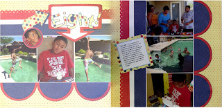
I'm so excited! My SDU instructor asked to make a layout to post in JoAnn's to use as advertisement for her class. I thought about making a new layout, but wasn't sure that I would be willing or able to part with a new layout...especially since it takes me so long to make one. So I decided to basically re-do a layout that I had already done for her class.
The problems began when I realized that I didn't have two sheets of the original color I had used as the background. I also didn't have enough paper left used in the first layout to make the water, which by the way wasn't 12 inches wide anyway and necessitated me trimming my background and layering it on another piece of cardstock.
So...off to Michael's I went for more cardstock. Here is the original layout posted several weeks ago and blogged about here:
Here is the new...and [I think] improved layout...
Thanks for looking!
Thursday, July 22, 2010
A Different Direction
Have you ever started a layout with a specific outcome in mind, and as you begin to work, you realize it is taking a totally different direction and you feel powerless to correct it? That's what happened with this layout.
I made this layout to satisfy two challenges; the first was from a sketch posted on the Sistas Scrap Too messageboard over at cricut.com. The sketch was one done by Valerie Salmon and posted over at Got Sketch. You can see the sketch here. The other challenge I decided to satisfy was one from Stacy Julian sent to the LOM Community over at BigPictureScrapbooking.com. We were to create a layout using seven pictures from our Storage Binders.
Since this layout was about my son's birthday, my intent was to use colors and patterned paper to create a layout that projected a happy day. Now remember, I am "patterned paper challenged." So, I decided to pull some paper from my DCWV - Fun in the Sun Summer Stack a stack that I bought on clearance a year or two ago. While the colors and the patterns go together well, I ended up with an unintended result. Despite the yellow background, my layout started to have a decidedly "4th of July" feel to it. So I chose another pattern to use for the title to kind of offset that feel. Not so sure that I succeeded, but it is what it is.
What I learned with this layout is:
Thanks for looking!
I made this layout to satisfy two challenges; the first was from a sketch posted on the Sistas Scrap Too messageboard over at cricut.com. The sketch was one done by Valerie Salmon and posted over at Got Sketch. You can see the sketch here. The other challenge I decided to satisfy was one from Stacy Julian sent to the LOM Community over at BigPictureScrapbooking.com. We were to create a layout using seven pictures from our Storage Binders.
Since this layout was about my son's birthday, my intent was to use colors and patterned paper to create a layout that projected a happy day. Now remember, I am "patterned paper challenged." So, I decided to pull some paper from my DCWV - Fun in the Sun Summer Stack a stack that I bought on clearance a year or two ago. While the colors and the patterns go together well, I ended up with an unintended result. Despite the yellow background, my layout started to have a decidedly "4th of July" feel to it. So I chose another pattern to use for the title to kind of offset that feel. Not so sure that I succeeded, but it is what it is.
What I learned with this layout is:
- I really need to work at not pasting things down as I go. I have tendency to do this which means it becomes very hard to make changes if you're not happy with the result.
- The paper was not cardstock weight and usually when I use paper this light I adhere it to another piece of cardstock. I was lazy this time and didn't do so. Consequently there was some buckling in some of the pieces that I adhered and a little warping in the layout.
- I should have made the frame for my title a little narrower from top to bottom, or placed the letters a little higher within the frame. The current placement gives the look of trapped white space.
Thanks for looking!
Tuesday, July 13, 2010
52 Card Pick-Up - More Fun Techniques
Well...it's been more than a minute since I've posted new techniques from my 52 Card Pick-Up class over at Big Picture Scrapbooking; the reason for that is, I got behind. I spent Thursday through today catching up with ten or eleven assignments I had missed. Because I was so far behind, it was simply a matter of trying the technique and getting it done (without being particularly "artsy") so that I could move on to the next one. I'm not going to post them all because I don't want to bore you; rather, I'm going to post the ones that were the most fun and that I see myself using on a card or layout in the future.
This first one probably jazzed me the most! I know it is kind of hard to tell from the picture, but the entire photo of my DS is covered with clear glass microbeads. It gives it the coolest kind of texture. Very easy too...you use that Terrifically Tacky tape on the picture, pour the beads on and voila!
This next one ran a close second.... we used a mixture of a really strong glue and a tiny bit of water to add glitter to chipboard accents. Those paisley chipboards are some Maya Road. I bought them a long time ago (I think when Recollections closed) and I had no idea what I was going to do with them other than paint them. I KNEW I wasn't going to cover them with paper...it would have been too much of a bother to trim them. Now I need to find out if some kind of fixative can be applied to glittered pieces to keep the glitter from migrating off.
This next one involved plain old ordinary white tissue paper, Mod Podge, and acrylic paint. We put the tissue down first, then painted with our darker color (mine was black) and then caught the ridges with our lighter color. Unfortunately, when I went over it with the white, I didn't realize there was still some water on that foam brush so the white kind of bled past the ridges. But you know me, I got the general idea, and was too lazy to do it over again...c'est la vie. I see this as a great way to make landscapes on layouts or cards.
Here was a really simple one...paint on the back side of a transparency and then use Glaze pens to journal on the unpainted side. I also used my rubber stamps and some solvent ink to make some flowers from the same transparency. Please ignore the messy handwriting.
Another easy one! Have you ever thought of printing a photo on card stock to use as a background or even as an integral part of the layout? This photo was changed to a watermark, and then some of the brightness and contrast was put back in before printing. Don't know that I'm gonna want to drive over that bridge the next time I travel from Arizona to Vegas!
And finally....using clear embossing ink and powder to make a tone-on-tone design. I really like this technique but so far, with every heat-embossed project I've done, I've gotten stray ink or powder all over the piece. Gonna have to work on that. I took this opportunity to try a small mosaic cut with the picture. That's something I've always wanted to try, but haven't had the guts to do so. I hear this technique is best used with landscape type photos rather than those with people in them.
Thanks for looking at my latest installment of 52 Card Pick-Up.
Labels:
52 Card Pick-Up,
Big Picture Scrapbooking,
Technique
Monday, July 12, 2010
Birthday Card using Inchies
A few weeks ago, a challenge was posted on the Scraps of Color group to create a card using at least three "inchies" and a flower. My soror's birthday was coming up so I decided to use that challenge to make a card for her. The first thing I had to do was get some "inchie" stamps. I'd never heard of them before...they're simply rubber stamps that are approximately one inch square. I went to Michael's where they really didn't have much of a selection, so I ended up with Fiskars Squarely Sentimental clear stamps, which thank heavens were on sale for 40% off. I also ended up with the flower stamp (also 40% off) and for the first time tried my hand at adding a little color to a stamp using some very old EK Success pencils that I have. Pulled out my trusty Forever Young cartridge for the image and some old Creative Memories paper. I just could not tie a nice, neat bow so ended up tacking the ends of the ribbon behind the background. The ink used was Studio G and Technique Tuesday. Note to self: Start a Copics collection and learn how to tie ribbon! Thanks for Looking!

Subscribe to:
Comments (Atom)


