Pages

Showing posts with label DCWV. Show all posts

Wednesday, June 24, 2015

Keeping it All Together

If you're anything like me, you have lots and lots of coordinating paper stacks from companies like DCWV or Recollections.  And, if you're anything like me, when you make a project from one of your paper stacks and have pieces of coordinating cardstock left over, you really want to store them with the stack they came from.  You could just slide them in the front of the pad; but, they might fall out, depending on how you store your stacks.

So...I thought I'd share a simple tip I came up with a long time ago, but just rediscovered (remember...I haven't visited my paper in a very long time LOL!). All it requires is gallon size zip lock bags, which you can find at your local dollar store, and some Scor "like" tape.


Open your paper pad, and adhere a strip of Scor tape along the top of the cardboard in the back of the stack. Open the ziplock bag and lay it across the Score tape, pressing it firmly into place.

That's it! You're done! As long as the bag remains open, it will hold a strip of paper that is 12" long.


Hope this helps somebody! Thanks for looking.

WrinkleFreeDiva!


Saturday, May 28, 2011

Scrap. Set. Match!!!!

For some reason, I had tennis on my mind (even though I haven't played since college) when I came up with the title for this post. Game. Set. Match! Get it??? If you don't, please humor me and pretend like you do.

For those of you who have been with me since the beginning, you know that I am patterned paper challenged!
I've blogged about it many times, but most specifically here.

***I just noticed that all of my followers have disappeared. I hope that's a glitch with blogger and not that people don't like me anymore!

Matching up patterned paper is tough for me and can consume a great chunk of my crafting time. Over the years I've acquired lots and lots of patterned paper...mostly purchased on a whim, with no project in mind. For probably the first eight or nine years of my scrapbooking life, I purchased 10 to 12 sheets of each pattern. Seriously? What was I thinking? I'm still trying to figure out how to use up some of that paper. But I digress....

I think I've found the key to my matching pp problem. I took a Spellbinders card class over at My Creative Classroom. While trying to choose paper for the cards, I pulled out a few DCWV cardstock stacks. (I just began acquiring them within the past year or two. JoAnn's has great sales!). I decided that whatever paper I used for each card would come from the same stack, thus assuring that either the colors or the patterns would work together. And...I was smart this time, and chose my paper BEFORE chosing my Copic markers for coloring.

For my Mother's Day Card, I used the DCWV Summer Dream stack. The bonus with this stack is that all of the paper is double-sided. Makes matching a no-brainer! There are three different patterns used in this card AND some embossing. The sentiment was done in Microsoft Word.


For this sympathy card, I pulled from an old Creative Memories Power Palette set called Blush Blooms. Though it's kind of hard to see in the picture, this card uses four different patterned papers, not including the white cardstock. The sentiment for this one was also done on the computer.


All of the patterned paper in this layout came from the DCWV Guy Stack.


So...I've decided that for most of my paper needs, I'll probably stick with DCWV. Their patterned cardstock is of great quality and they have a lot of selection. They are constantly coming out with new stacks. I need to start crafting on a budget and more often than not, these stacks are on sale at JoAnn's for around $10. If not there's always a coupon. Does this mean that I won't ever buy from other manufacturers or purchase single sheets again? No....but I will make every effort to buy paper that is in sets or, if buying single sheets, buy coordinating sheets that will work together for a project. Having the paper already matched removes some of that decision making that slows me down and gets in the way of my creativity.

So...our lesson for today....wait for it...wait for it!!!!

When setting out to SCRAPbook or make a card, consider purchasing and using paper that comes in SETs. It makes MATCHing patterned paper that much easier!

BTW...Despite the amount of time it took me to make those two cards, I DID manage to give them away!
Thursday, July 22, 2010

A Different Direction

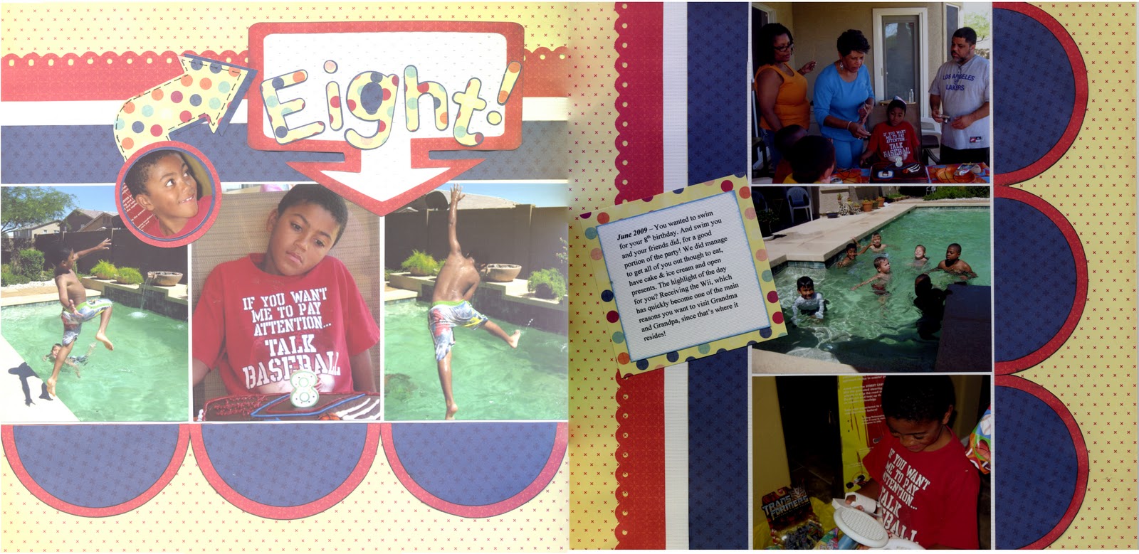
Have you ever started a layout with a specific outcome in mind, and as you begin to work, you realize it is taking a totally different direction and you feel powerless to correct it? That's what happened with this layout.

I made this layout to satisfy two challenges; the first was from a sketch posted on the Sistas Scrap Too messageboard over at cricut.com. The sketch was one done by Valerie Salmon and posted over at Got Sketch. You can see the sketch here. The other challenge I decided to satisfy was one from Stacy Julian sent to the LOM Community over at BigPictureScrapbooking.com. We were to create a layout using seven pictures from our Storage Binders.

Since this layout was about my son's birthday, my intent was to use colors and patterned paper to create a layout that projected a happy day. Now remember, I am "patterned paper challenged." So, I decided to pull some paper from my DCWV -  Fun in the Sun Summer Stack a stack that I bought on clearance a year or two ago. While the colors and the patterns go together well, I ended up with an unintended result. Despite the yellow background, my layout started to have a decidedly "4th of July" feel to it. So I chose another pattern to use for the title to kind of offset that feel. Not so sure that I succeeded, but it is what it is.


What I learned with this layout is:
  1. I really need to work at not pasting things down as I go. I have tendency to do this which means it becomes very hard to make changes if you're not happy with the result.
  2. The paper was not cardstock weight and usually when I use paper this light I adhere it to another piece of cardstock. I was lazy this time and didn't do so. Consequently there was some buckling in some of the pieces that I adhered and a little warping in the layout.
  3. I should have made the frame for my title a little narrower from top to bottom, or placed the letters a little higher within the frame. The current placement gives the look of trapped white space.

Thanks for looking!