The next thing I worked on at the retreat was a layout I began in June while taking SDU at Joann's. If memory serves me correctly, we chose the pictures first and were then instructed to do a split complementary color scheme layout. As they are Christmas photos I was glad not to be doing the traditional red-green color combination. I chose blue-green cardstock for my background, and the split complementary colors for that are red and orange. I seem to remember having trouble weaving in the orange and changing my color scheme. I went with a red/yellow-green/blue-green combo which are also split complementary colors.
This layout sat for awhile because I had envisioned something totally different with respect to the title and embellishments, but couldn't translate what was in my head to my Gypsy and Cricut. I originally intended to have one letter per train car for the title, but size-wise it wasn't working for me. So the letters ended up by themselves on the train track. I also envisioned an entire Santa's Village scene on the right side of the page, but that didn't come together either so I settled for the gingerbread house. I hadn't brought anything to color my embellishments with and so borrowed my friend's Smooch inks to color in the different elements on the house. They never dried. When I came home, I had the bright idea to use my Stickles and what a difference they made.
So this is what I learned...if an idea gets stuck in your head and won't come out, it's okay to make a shift and try something else. Also, Smooch inks don't dry on DCWV glitter cardstock. I probably could have set it with a heat gun, but I didn't have one with me at the time. Chances are, they won't dry on any other kind of slick cardstock either. And now on to the layout! Thanks for looking!
Showing posts with label Cricut Cart - Learning Curve. Show all posts
Monday, October 4, 2010
Thursday, July 22, 2010
A Different Direction
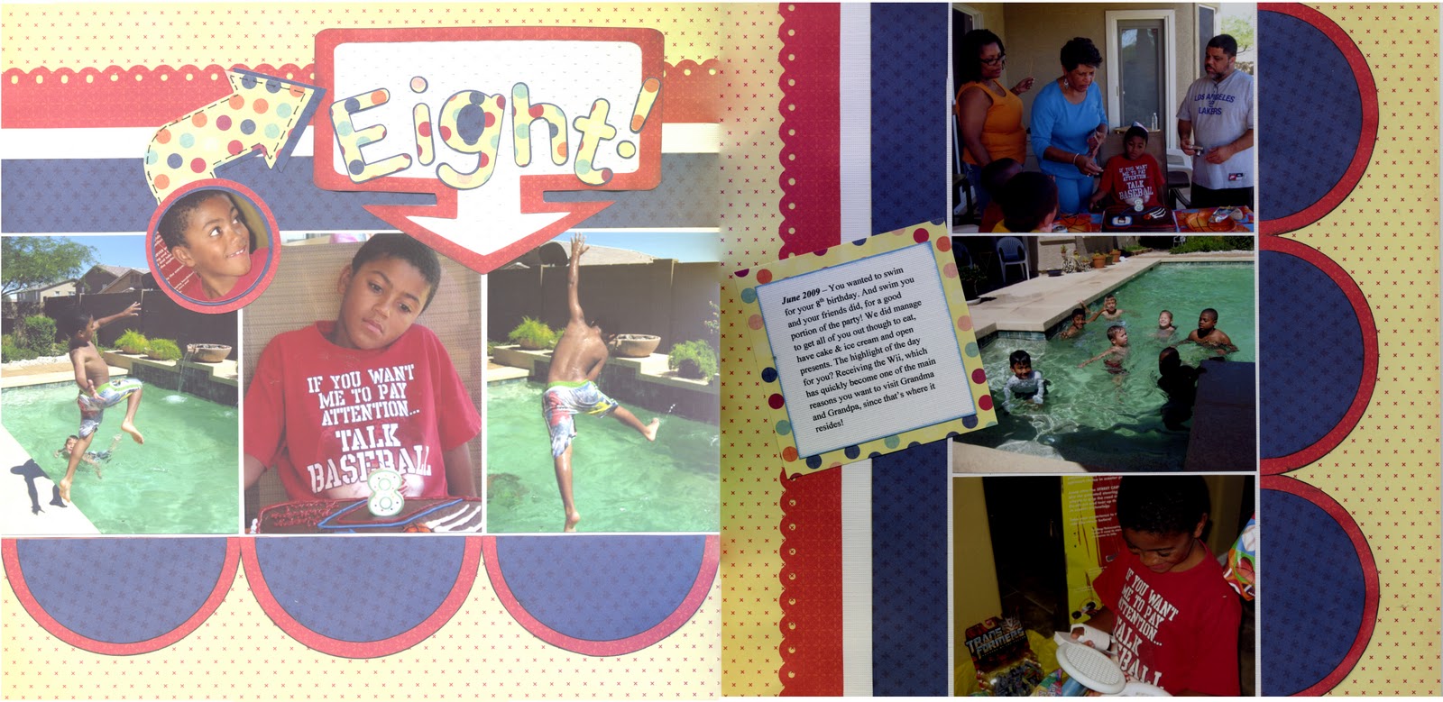
Have you ever started a layout with a specific outcome in mind, and as you begin to work, you realize it is taking a totally different direction and you feel powerless to correct it? That's what happened with this layout.
I made this layout to satisfy two challenges; the first was from a sketch posted on the Sistas Scrap Too messageboard over at cricut.com. The sketch was one done by Valerie Salmon and posted over at Got Sketch. You can see the sketch here. The other challenge I decided to satisfy was one from Stacy Julian sent to the LOM Community over at BigPictureScrapbooking.com. We were to create a layout using seven pictures from our Storage Binders.
Since this layout was about my son's birthday, my intent was to use colors and patterned paper to create a layout that projected a happy day. Now remember, I am "patterned paper challenged." So, I decided to pull some paper from my DCWV - Fun in the Sun Summer Stack a stack that I bought on clearance a year or two ago. While the colors and the patterns go together well, I ended up with an unintended result. Despite the yellow background, my layout started to have a decidedly "4th of July" feel to it. So I chose another pattern to use for the title to kind of offset that feel. Not so sure that I succeeded, but it is what it is.
What I learned with this layout is:
Thanks for looking!
I made this layout to satisfy two challenges; the first was from a sketch posted on the Sistas Scrap Too messageboard over at cricut.com. The sketch was one done by Valerie Salmon and posted over at Got Sketch. You can see the sketch here. The other challenge I decided to satisfy was one from Stacy Julian sent to the LOM Community over at BigPictureScrapbooking.com. We were to create a layout using seven pictures from our Storage Binders.
Since this layout was about my son's birthday, my intent was to use colors and patterned paper to create a layout that projected a happy day. Now remember, I am "patterned paper challenged." So, I decided to pull some paper from my DCWV - Fun in the Sun Summer Stack a stack that I bought on clearance a year or two ago. While the colors and the patterns go together well, I ended up with an unintended result. Despite the yellow background, my layout started to have a decidedly "4th of July" feel to it. So I chose another pattern to use for the title to kind of offset that feel. Not so sure that I succeeded, but it is what it is.
What I learned with this layout is:
- I really need to work at not pasting things down as I go. I have tendency to do this which means it becomes very hard to make changes if you're not happy with the result.
- The paper was not cardstock weight and usually when I use paper this light I adhere it to another piece of cardstock. I was lazy this time and didn't do so. Consequently there was some buckling in some of the pieces that I adhered and a little warping in the layout.
- I should have made the frame for my title a little narrower from top to bottom, or placed the letters a little higher within the frame. The current placement gives the look of trapped white space.
Thanks for looking!
Subscribe to:
Posts (Atom)